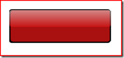
Button Looks in WPF
Smaller sized button.
The trick is to place a rectangle first, with the color of your choice. Then place another rectangle, with half the height on the top of this one and then give it a LinearGradientBrush, but half the height and place it on the top portion of the first rectangle. I would share more information on this, once my friend Ashish actually teaches me how to do this kind of stuff. Anyway, the XAML for this one is shown below.
1: <Grid x:Name="LayoutRoot">
2: <Rectangle Fill="#FFF01717" Stroke="#FF000000" StrokeThickness="2"
3: RadiusX="5.5" RadiusY="5.5" HorizontalAlignment="Stretch"
4: Margin="240,163,247,0" VerticalAlignment="Top" Height="80" Width="241">
5: <Rectangle.BitmapEffect><EmbossBitmapEffect Relief="1"/></Rectangle.BitmapEffect>
6: </Rectangle>
7: <Rectangle Opacity="0.5" Stroke="{x:Null}" RadiusX="5.5"
8: RadiusY="5.5" Margin="240,165,247,0" VerticalAlignment="Top"
9: Height="38" Width="241">
10: <Rectangle.OpacityMask>
11: <LinearGradientBrush EndPoint="1,0.5" StartPoint="0,0.5">
12: <GradientStop Color="#FFFA1010" Offset="1"/>
13: <GradientStop Color="#FFFFFFFF" Offset="0.01"/>
14: </LinearGradientBrush>
15: </Rectangle.OpacityMask>
16: <Rectangle.Fill>
17: <LinearGradientBrush EndPoint="0,0" StartPoint="0,1">
18: <GradientStop Color="#FFE41818" Offset="0"/>
19: <GradientStop Color="#FFFFFFFF" Offset="1"/>
20: </LinearGradientBrush>
21: </Rectangle.Fill>
22: </Rectangle>
23: </Grid>

